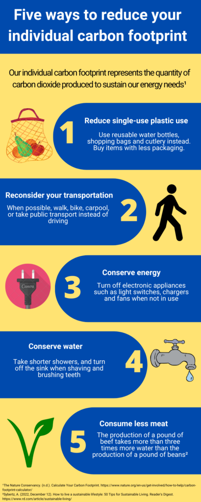
This week, I decided to create a Canva infographic on 5 ways to reduce your individual carbon footprint. I chose this topic because I think it is easy to forget that we have the individual capacity to change the amount of greenhouse gases that are released into the atmosphere. If we all took small measures to reduce our carbon footprint, we can make a positive impact and reduce carbon dioxide emissions.
Which design principles did you use to create your infographic in Canva? Which elements of a ‘good infographic’ were you able to incorporate? What other principles did you consider?
For my infographic, my main goal was to maintain consistency and simplicity. I followed most of the six promising practices for infographic design by Easel.ly (2021). For instance, I limited the colour palette to two highly contrasting colours: blue and yellow. The purpose of this was to attract the learner into reading my infographic with inviting colours. This was a method in which I leveraged contrast to accentuate important overall design elements. I also included only one font style to create consistency in the infographic so that it was easier to follow. Additionally, I included simple imagery that can be easily understood, which allows the reader to quickly link the text with the visual. I believe that infographics should only include the most important key points, so that the learner or reader does not have to spend too much time trying to understand your work. I followed the Contiguity Principle in that I kept pictures and text in close proximity as this makes it more effective for the learner to understand the concept compared to if the graphics and text were more spaced apart. For instance, I put graphics that corresponded to text very close to each other to engage the reader.
Graphic design is inherently visual – what additions or modifications could you make to ensure that learners with visual impairments have access to the same information in an online setting?
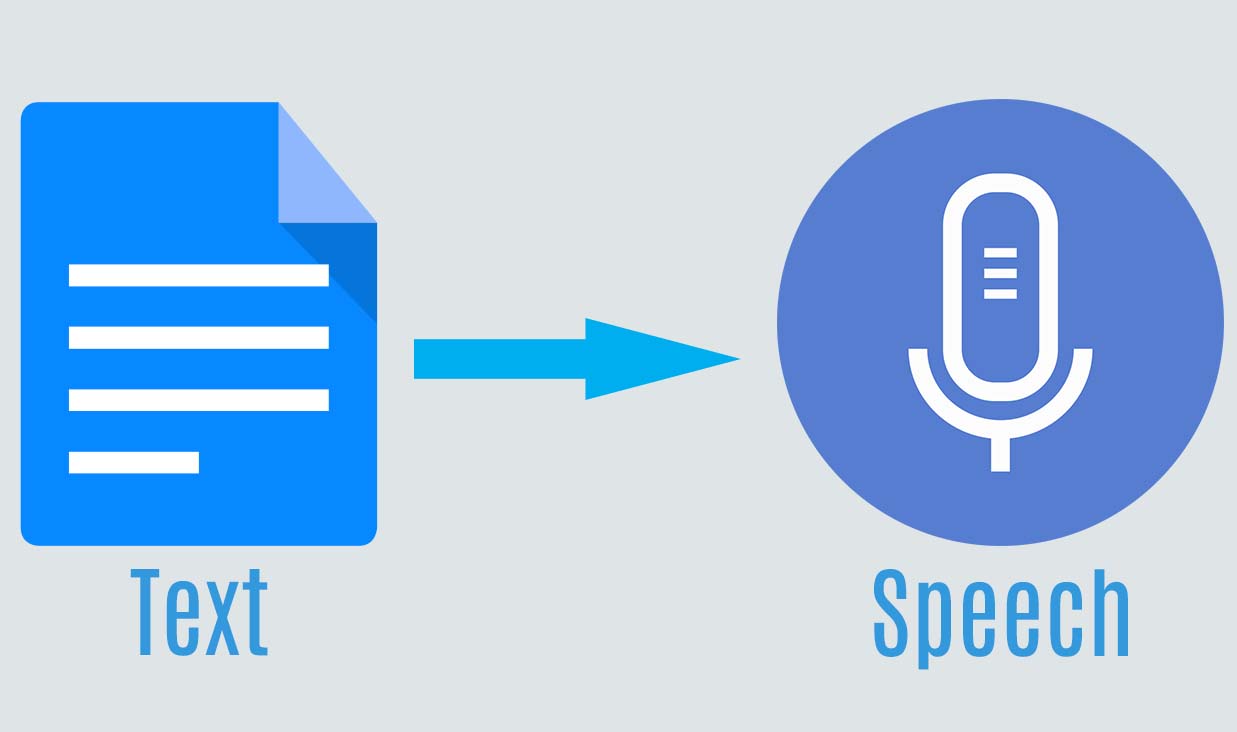
I believe that those with visual impairments should have the ability to understand a graphic equally as well as others without a visual impairment. This can be done through adding a text-to speech function to the infographic, which can help describe what the text entails. This would allow visually impaired learners to better understand the concepts presented in the infographic. Relevant audio clips could be added to sections of the infographic which could help support the text’s important points. For instance, if you were making an infographic about humpback whale acoustics, it would be beneficial to add audio clips of the animal’s vocalizations. I also think it would be very useful to include a function that would allow the user to hear a description of the pictures on the infographic. This function would allow the visually impaired learner to improve their association between text and pictures.
Have you used Text to Speech tools before? Did you find it useful?
I have used this tool in high school but not in university. I believe that this is a powerful tool that can be very useful for those with visual impairments as it allows them to learn using more than one sense (i.e. stimulating their visual and auditory senses). Personally, I find this tool very useful when I am reading long scientific papers as it helps me remain focused on the content.
References
Easel.ly, Crash Course in Infographics Webinar
Recent Comments